Skedulo Plus extension components overview
Understand the pages and components that are used to build Skedulo Plus extensions.
Overview
The components are used to define the layout of the page and the first page that is displayed when the extension is opened.
| Property | Description |
|---|---|
firstPage |
Indicates which page to display first in the extension. A page is a layout component that is defined in the ui_def.json file. |
pages |
An object that contains a type that specifies the layout for the page. An extension can consist of multiple pages. |
readonly |
Indicates that the forms is read-only. When set to true, there is no Save button. |
Page types and page components
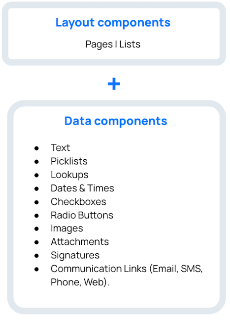
Skedulo Plus extensions are made up of either a single page, or of bundles of pages.
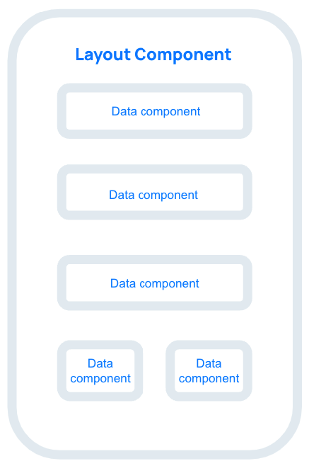
Pages define the structure of the page and layout of the page components. Components are the smallest units that represent a piece of data in the UI definition, such as how a text field or a button is rendered.
A page in a mobile extension can be either a list page or a flat page, but it can have multiple page components.
 |
 |
Form definition example
The following example demonstrates how these form properties are defined in the ui_def.json file for a Job Products list page.
{
  "firstPage": "JobProductListPage",
  "pages": {
    "JobProductListPage": {
      "title": "form.JobProductListPages.JobProductTitle",
      "type": "list",
      "sourceExpression": "formData.JobProducts",
      "emptyText": "form.JobProductListPages.Empty",
      "itemLayout": {
        "type": "titleAndCaption",
        "title": "form.JobProductListPages.ItemTitle",
        "caption": "form.JobProductListPages.ItemCaption"
        }
    }
  },
}
Feedback
Was this page helpful?