List page components
Overview
List page data components, or components, are used to render a view for each child page from the list page component.
These components cannot be used elsewhere, such as flat pages. The list page data components render a view for each child page from the list page component sourceExpression property.
Abstract List Page Data Component
The Abstract List Page Data Component is like a blueprint for all the child components mentioned below it in the UI definition. Any properties defined in this abstract component will be inherited and usable for all the components beneath it.
Title and caption component
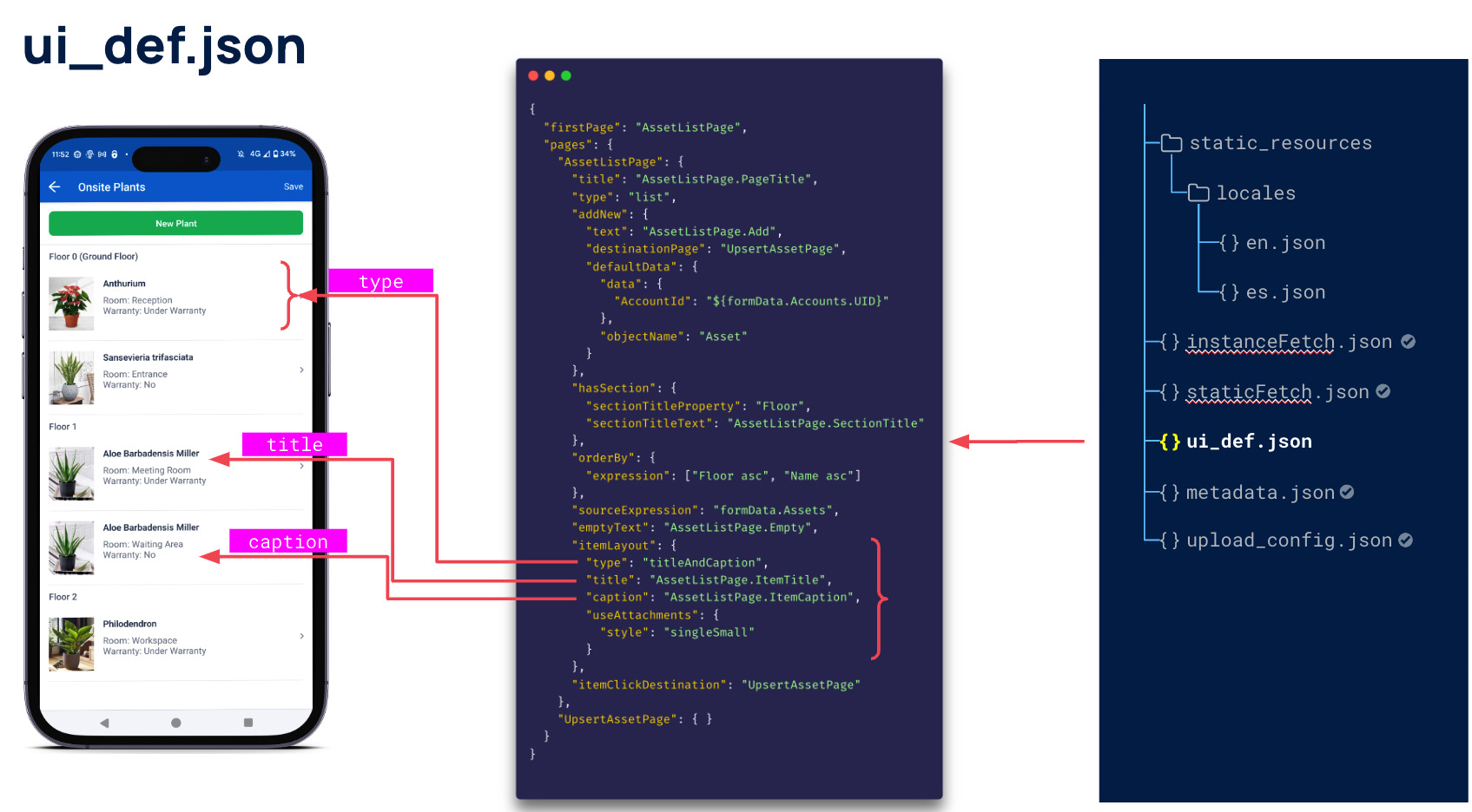
List item components can be seen as units or items that display in a tabular manner. Each tile, or “cell” in the table, can have a title and caption.
| Property | Description |
|---|---|
type |
"titleAndCaption" |
title |
The title of the cell row. Renders as the first line of the child cell.Localized expression string |
caption |
The caption of the cell row. Renders as the second line of the child cell.Localized expression string |
Example:
"itemLayout": {
  "type": "titleAndCaption",
  "title": "LineItemsListPage.ItemTitle",
  "caption": "LineItemsListPage.ItemCaption",
  ...
}

| Property | Description |
|---|---|
useAttachment |
Defines if the cell row is able to show attachments. |
| tags | The tags used for an item in the list view. |
useAttachments
The useAttachments property in the ui_def.json file is used to display an image or images in a cell row on a List Page.
Note
To use theuseAttachments property, the object of the item context must be defined as hasAttachments in the form metadata. See Metadata for Skedulo Plus extensions for more information.
| Property | Description |
|---|---|
categoryName/undefined |
The category of the attachments belong to the item context that is being rendered. If this is undefined, all images from that item context will be displayed. |
style |
singleBig / singleSmall. The image display style. |
The following example shows how to use the useAttachments property to display images in a cell row on a List Page:
"itemLayout": {
  "type": "titleAndCaption",
  "title": "LineItemsListPage.ItemTitle",
  "caption": "LineItemsListPage.ItemCaption",
  "useAttachments": {
    "style": "singleSmall"
  },
The metadata.json file for this extension also includes the following property, which tells the extension engine which object in the item context has attachments:
"hasAttachments": ["ReplacementTicketLineItem"],

singleBig style
The cell fetches the latest image and displays it in the cell row. If there are multiple images, the first image will be displayed.

singleSmall style
The cell fetches the latest image and displays it in the cell row as a small image alongside other list page data. If there are multiple images, the first image will be displayed.

Tags
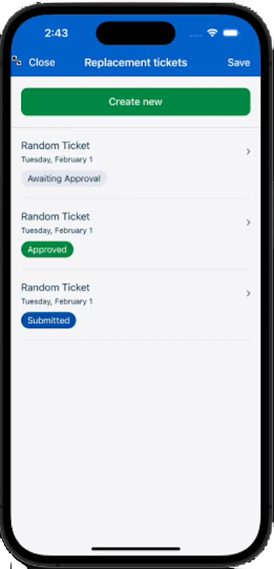
The tags property is used to display one or more tags in a cell row on a List Page.
| Property | Description |
|---|---|
items |
An array of tags to be displayed in the cell row. |
items[].themeValueExpression |
The expression that returns the value of the tag. Values are success,primary, ordefault Also supports [branching logic]. |
The following example shows how to use tags to define the status of tickets that need to be approved and submitted:
"itemLayout": {
  "type": "titleAndCaption",
  "title": "LineItemsListPage.ItemTitle",
  "caption": "LineItemsListPage.ItemCaption",
  "useAttachments": {
    "style": "singleSmall"
  },
  "tags": {
    "type": "fixed",
    "items": [
      {
        "text": "LineItemsListPage.ItemStatus",
        "themeValueExpression": [
          {
            "condition": "item.Status == 'Ticket Approved'",
            "value": "success"
          },
          {
            "condition": "item.Status == 'Submitted'",
            "value": "primary"
          },
          {
            "value": "default"
          }
        ]
      }
    ]
  }
}
ThethemeValueExpression deviates from the conventional string expression format, as it assumes the form of an array object. This array object includes the subsequent properties:
-
condition: This property represents the condition to check. It should be a data expression that ultimately results in a boolean value. -
value: Thevalueproperty corresponds to the data expression value. If the condition is met, this value will be returned.
In the example provided, themeValueExpression behaves in the following way when asked to return a value:
- If the condition
item.Status == 'Ticket Approved'is met, the valuesuccessis returned. - If the condition
item.Status == 'Submitted'is met, the valueprimaryis returned. - Otherwise, the value
defaultis returned.

However, if you don’t require this branching logic, you can simplify the themeValueExpression in the following way:
"themeValueExpression": "success"
With this configuration, the themeValueExpression will always return the success vale, regardless of the condition.
Feedback
Was this page helpful?