Flat page components
Overview
Flat page components are used to represent the smallest units that can be used on a flat page. These components are used to render data in a specific way, such as how text is displayed.
Flat pages can also be referred to as standard pages. They are generally a single form for users to fill in and can comprise one or more page components, including sections, text fields, multi-selectors, data time pickers, attachment editors, and so on.
Abstract/common behavior for flat page components
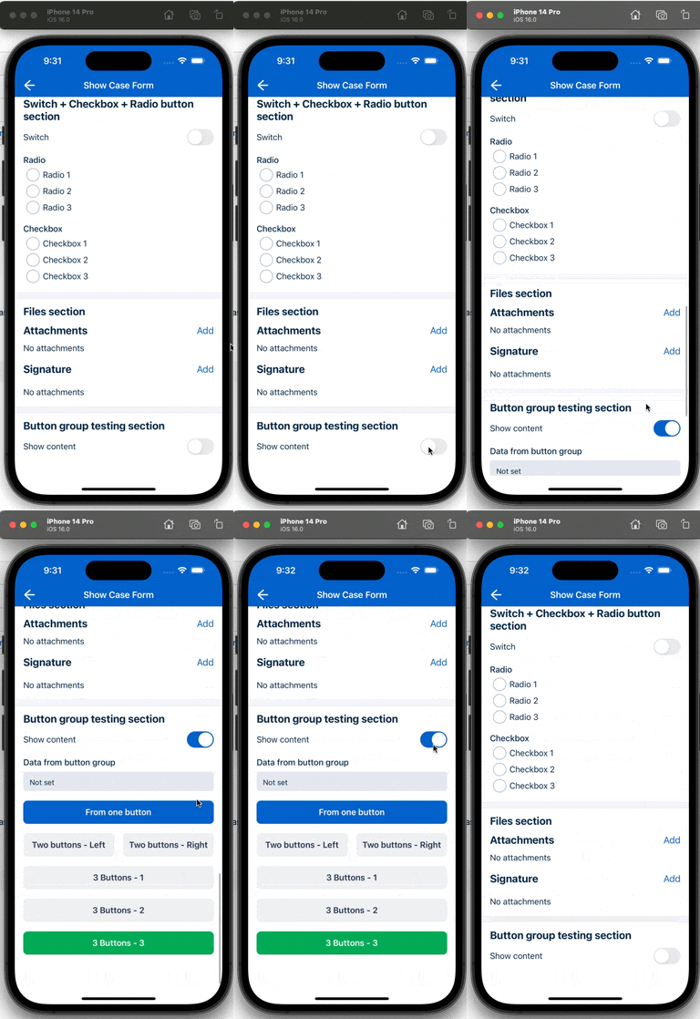
Properties and expressions control the behavior and visibility of flat page components.
Flat page component common properties
| Property | Description |
|---|---|
showIfExpression |
When the showIfExpression property is defined, it adjusts the component visibility based on the boolean value returned on the expression. |
Flat page component editor properties
| Property | Description |
|---|---|
| Common properties (see above) | The common properties are used to control the behavior and visibility of the component. |
title |
The title of the field. |
caption |
The caption of the field. This could be a brief description or explanatory text displayed at the bottom of the component. |
validator |
Validation logic for the field. |
readonly |
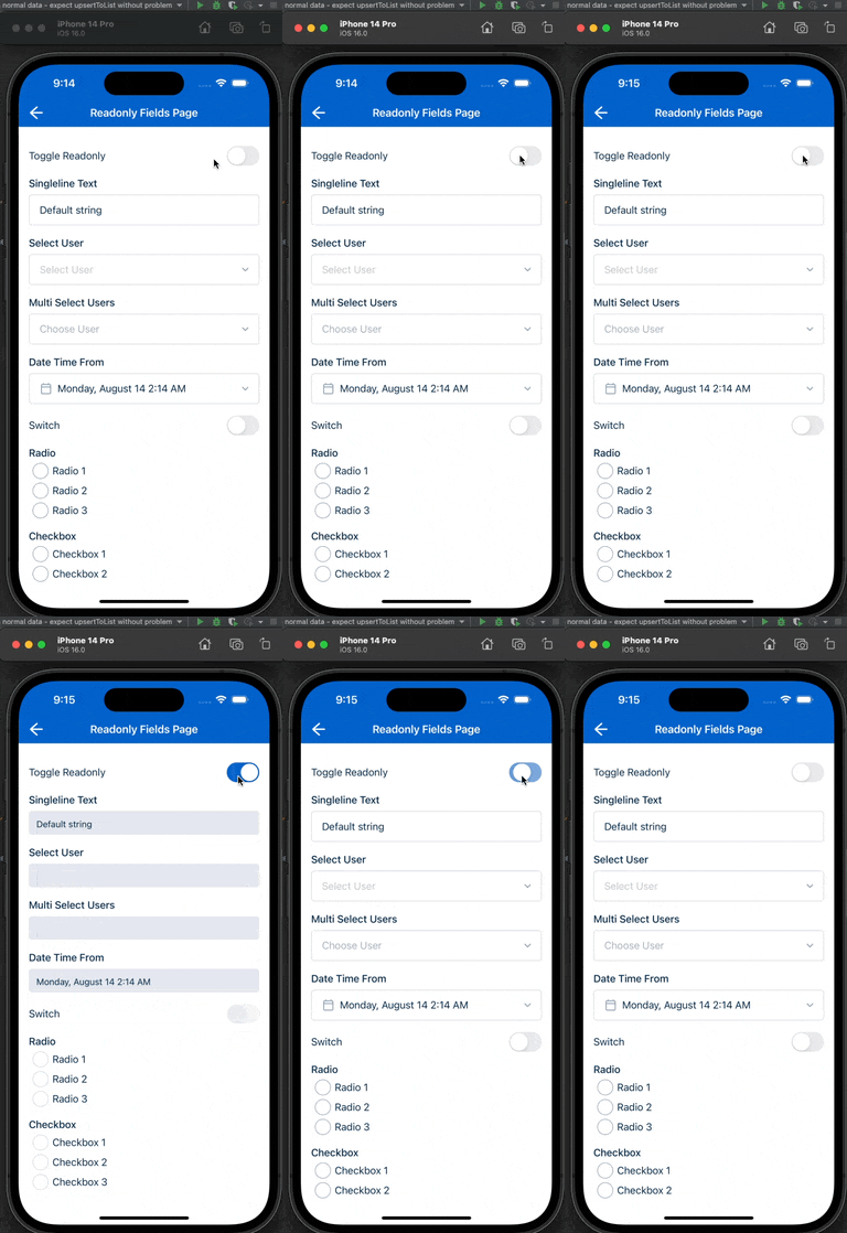
Indicates whether or not an editor control is read-only. |
mandatory |
True or False expression. An asterisk ( * ) is shown on the title of the editor if it is mandatory for the user to fill. Note that this property only controls whether the asterisk will show on the UI and won’t affect the validation. Use the validator property to add validation. |
Property descriptions and examples
showIfExpression
The showIfExpression property is used to control the visibility of a component. When the showIfExpression property is defined, it adjusts the component visibility based on the boolean value returned on the expression.
For example:
{
  "showIfExpression": "formData.JobProducts.length > 0"
}

readOnly
The readOnly property is used to return a boolean value that defines whether or not an editor control is read-only.
The following examples set the editable field to read-only:
"readonly": "cf.canEdit(pageData.Status) == false",
Or:
"readonly": "false",

Read-only can be defined at the component-level or at the page-level. If the page-level readonly property is set to true, all components on the page will be read-only. However, a page that has a readonly property set to false can still have components that are read-only and components that are editable.
Feedback
Was this page helpful?